Ikea Brighton (Mother)
Campaign Review
1. Core message & clarity (Score: 8)
Strengths
-
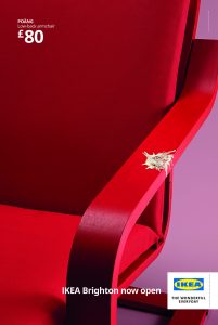
- The large red chair instantly draws the eye to the featured product (POÄNG low-back armchair).
- Bold white text “£80” and “IKEA Brighton now open” clearly communicate price and location.
- The seagull splatter on the armrest is a simple but effective visual cue linking the ad to a seaside town (Brighton)
Weaknesses
-
- Viewers unfamiliar with Brighton or its seagulls might not immediately catch the intended pun.
Competitor comparison
-
- Dunelm: Typically uses styled interior scenes rather than a single-product, location-pun approach—so less direct local messaging.
- B&M: Focuses heavily on price-driven layouts; rarely ties openings to local quirks.
- Wayfair UK: Primarily digital catalogue-style ads with minimal local flavor, so lower clarity on physical store launch.
2. Originality (Score: 8)
Strengths
-
- The unexpected use of seagull droppings on a clean chair arm creates surprise and memorability.
- Monochrome red against a pastel backdrop is visually striking and differs from typical lifestyle shots.
Weaknesses
-
- Some viewers may find the “dirt” concept off-putting rather than clever.
Competitor comparison
-
- Dunelm: Relies on cozy room-set photography—less inventive.
- B&M: Straightforward product+price layout with basic backgrounds.
- Wayfair UK: Prefers polished digital room renders over cheeky real-world humor.
3. Emotional resonance & persuasiveness (Score: 7)
Strengths
-
- Humorous nod to a local nuisance (seagulls) builds an immediate smile or chuckle for Brighton locals.
- Encourages a sense of community pride: “Our town has its quirks—and now IKEA’s here.”
Weaknesses
-
- Lacks deeper emotional pull (e.g., family moments or lifestyle aspiration).
Competitor comparison
-
- Dunelm: Leverages warmth and comfort to build emotion; IKEA’s approach is lighter and more playful.
- B&M: Appeals to bargain-hunting excitement, less focused on wit.
- Wayfair UK: Tries aspirational décor imagery—more polished but less context-driven.
4. Brand recognition (Score: 9)
Visual:
-
- The classic IKEA logo appears at bottom right: “IKEA” in bold blue letters inside a yellow oval, set on a white background.
- Tagline “THE WONDERFUL EVERYDAY” sits beneath the logo.
Impact on overall brand perception
-
- Instant recall of IKEA’s brand colors and typography reinforces trust in quality and value.
- The playful twist (droppings) doesn’t dilute brand prestige; it enhances IKEA’s approachable, everyday-fun persona.
Competitor comparison
-
- Dunelm: Simpler black-and-white logo often blends into imagery—lower recall.
- B&M: Red block logo conveys discount focus but is less warm/friendly.
- Wayfair UK: Sleek wordmark and roof icon work online but lack outdoor impact.
5. Call-to-action clarity & likely response spike (Score: 8)
Strengths
-
- “IKEA Brighton now open” is unambiguous and immediate.
- There’s a strong incentive: discover a brand-new store locally.
Weaknesses
-
- No specific launch-day offer (e.g., free coffee, discount) to drive first-week footfall.
Competitor comparison
-
- Dunelm: Often pairs store openings with special offers, boosting response spike.
- B&M: Uses coupons/voucher callouts heavily.
- Wayfair UK: Digital only—can’t generate in-store footfall in the same way.
6. Shareability & retention (Score: 7)
Strengths
-
- Quirky visual (bird droppings on a bright chair) is easily shareable on social media with local hashtags.
- Unusual enough to be talked about at the bus stop or café.
Weaknesses
-
- Humor is very Brighton-specific; may not translate to broader audiences.
Competitor comparison
-
- Dunelm: Cozy interiors get moderate shares among décor enthusiasts.
- B&M: Sale flyers see high circulation but limited organic social sharing.
- Wayfair UK: Digital ads occasionally go viral in home-styling communities.
7. Overall effectiveness for the target audience (Score: 8)
Strengths
-
- Clear local tie-in appeals directly to Brighton residents and visitors.
- The minimalist layout keeps the focus tight: product, price, opening.
Weaknesses
-
- Tourists without local context might miss the seagull joke and see only a splatter.
Competitor comparison
-
- Dunelm: Broad homeowner appeal, less hyper-local.
- B&M: Targets bargain seekers nationally, less about location identity.
- Wayfair UK: Reaches online shoppers UK-wide, not footfall-focused.
8. Production quality (Score: 9)
Strengths
-
- High-resolution photography with crisp color saturation.
- Clean retouching and professional print-ready layout.
Weaknesses
-
- None apparent; print bleed and text legibility are well handled.
Competitor comparison
-
- Dunelm: Generally high, but often busier compositions.
- B&M: Functional print, but layouts can feel cluttered.
- Wayfair UK: Top-notch digital quality, though less often optimized for print.
9. Performance vs. competitor ads (Score: 8)
Strengths
-
- Unique seaside pun gives IKEA a standout edge in outdoor/print channels.
- Maintains strong brand presence while still surprising viewers.
Weaknesses
-
- Limited multi-channel tie-ins (e.g., no QR code or social handle).
Competitor comparison
-
- Dunelm: Seasonal sale ads perform steadily but lack local flare.
- B&M: Frequent, discount-heavy campaigns—higher frequency but lower memorability.
- Wayfair UK: Shines digitally but misses out on physical store excitement.
10. Estimated CTR vs. competitor ads (Score: 7)
Strengths
-
- Eye-catching visuals should drive both online searches (“IKEA Brighton”) and in-store visits.
Weaknesses
-
- As a static print/billboard ad, direct click-through is zero; lift must be measured via footfall or brand search.
Competitor comparison
-
- Dunelm: Print-driven footfall similarly tracked; often adds coupons to boost measurable response.
- B&M: Uses call-in codes or coupons for CTR estimates—our ad lacks that data hook.
- Wayfair UK: Digital CTR tends to be higher thanks to clickable assets, but no new store impact.
11. Ad goal alignment
- Implied goal: Announce IKEA’s new Brighton store and connect the brand to the town’s seaside character.
- Outcome: The ad successfully communicates a grand opening in Brighton with a clever local twist. It meets its goal.
Weighted average score: 7.9
Targeting & Platforms (no score)
Best target age & gender
-
- Adults 25–45 of any gender, especially young professionals and families setting up homes.
Best static-ad platforms
-
- Print: local newspapers, flyers
- Billboard: near transport hubs, beachfront promenades
- Google Display: geotargeted to Brighton area
- Meta (Instagram/Facebook): image-focused feed ads to Brighton audiences
- X (formerly Twitter): concise visual posts with local hashtags
Compliance with Advertising Standards
- The ad uses humor without offensive language or imagery.
- No misleading claims; price and opening claim are straightforward.
- Conforms to guidelines on hygiene and decency despite the seagull motif.
Recommendations
- Introduce a limited-time opening offer (e.g., free coffee in the IKEA café) to boost immediate footfall.
- Add a subtle QR code linking to store hours, parking info, and grand-opening events.
- Consider a digital animated version where the “dropping” appears on screen—driving engagement online.
- Expand the local tie-in in follow-up ads (e.g., feature Brighton landmarks in background).
- Test A/B with a second color variant (e.g., blue chair) to see which palette resonates more on social platforms.